Tuesday, 22 December 2009

Examples of Photos That I Took

Below are some examples of photos that I took to possibly use on my magazine.

DSC00367 DSC00368 DSC00371 DSC00372

The top row of pictures was taken to be used on my double page spread. As can be seen, I moved the shot along to the right in order to give some space I could crop away on the left hand side.

The bottom row of pictures was to be used on my contents page. The one-tone background was added to make cutting out of the picture easier.

The following photos were used on my cover and contents page.

PICT0650 PICT0652

These two pictures were designed to be used on my front cover. I decided I wanted a picture which evoked the ideas of a previous idea. The pose is commonly associated with ‘Queen’s Bohemian Rhapsody’. I used a one-tone background in order to allow me to cut out the faces of the band members and rearrange them in any way I wanted. I used the right hand picture as I felt the faces would become contorted if needed to be stretched on the right hand picture.

PICT0655

This picture was taken in order to be used on my contents page. The band member is dressed so as to look as though they have just come out of work. The idea for this is that I wanted a section to be dedicated to busking in people’s cities.

Thursday, 17 December 2009

Current Projects

Front Cover


This is my front cover for my music magazine.

Contents Page

This is the contents page for my music magazine.

Double Page Spread

This is the double page spread for my music magazine.

Wednesday, 16 December 2009

Mock Up


Front Cover

This is the front cover mock-up of my music magazine. It utilises a rough-cut banner and two rough-cut pieces at the side to specify information. The band was cut out and arranged in a manner which I found gave me more space where needs be. I think the colour scheme could be improved upon though and use a less imposing red.


Contents

This the contents mockup for my music magazine. I utilised the same colour scheme as I used on cover, this is again a black, red and white scheme. With an exact half of the page dedicated to the biggest articles in the magazine with a medium-sized picture. This means that I can use the other half to explain lesser articles within the magazine.


Thursday, 19 November 2009

Music Magazine Layout Mock-up


This is a mock up of what I would like my magazine to be laid out as. With a large centre picture I can have a larger picture which I could blend into the background or just have faded into the background. The banner at the bottom means that I could use contrasting colours to those used in the picture, background or title. I decided on the use of the pug as I thought my magazine would look empty if it was simply an image, logo/title and banner. I also thought this would let me focus on more than one artist.

Wednesday, 11 November 2009

Music Magazine Font Ideas

Fonts
I had a look at www.dafont.com and came down to 4 fonts I would like to use. These are mostly Runic but also include some Celtic typefaces. After asking around, I found that most people liked the first or second font. So on this advice I went with the second, as it looks bold but also runic enough to tie the title in with the font.

Tuesday, 10 November 2009

Music Magazine Title


Title

I decided that for a Classic Rock magazine a title drawing it's name from some description of mythology. After a small amount of research, I looked at Thor, Loki and Hel. I concluded that Loki would not be suitable, due to him being the God of Shapeshifting. This may force some readers to believe that the magazine will change every month.
After a bit more research, I decided that Hel was more suited to a Heavy Metal magazine than a Classic Rock magazine. Therefore, I decided to use Thor which is both mythological enough without being overly evil.

Saturday, 31 October 2009

Double Page Spread Analysis


The spread connects itself across the two pages by having the title of the article spreading across both pages. This helps to link them together and ensure that the reader is not put off by the first impression size of the article.

The article is again broken up by the reader as the article concentrates on separate band members at a time. This again ensures that the reader is able to concentrate on the article.

Friday, 23 October 2009

Contents - Final


For my analysis of my final cover, please see the presentation below.

Final, the end, the Cover

This is my final cover. My analysis is contained within the presentation below.

Planning Cover School Magazine

This presentation contains my planning and mock-ups for my School Magazine.

Sunday, 11 October 2009

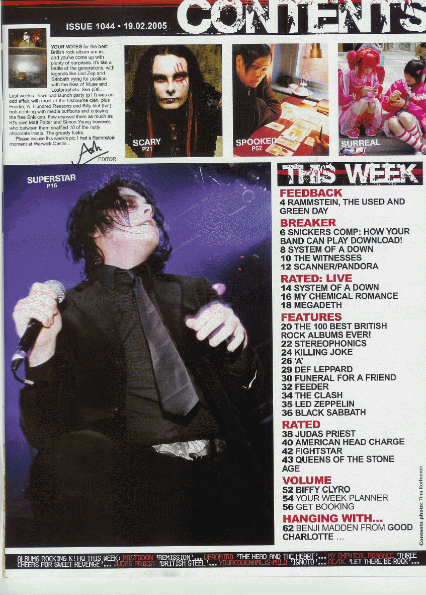
Contents Analysis: The Jumping of the Shark

As can be seen on the majority of this page are pictures with no band name or description. This is again the editor attempting to wean out those who are only in the magazine for a certain band as they will know them from sight and turn immediately to it.

Again colours play a massive part with black and white being used to contrast and draw the eye in to them and red being used as a contrast to both black and white to ensure it is read first.

Contents Analysis: The Spin-Off

The large picture does it's job well of brining in the reader with someone they are familiar with, after dragging them towards the picture the reader is naturally drawn to the larger list of contents down the left hand side. After this the reader will then look to the less important articles at the top or bottom.

Another interesting technique is the use of contrasting colours across the entire page, this is evident in the text, backgrounds and even in the pictures of Artists and bands.

Contents Analysis: The Original


The majority of the page is taken up by a picture of Oasis. However it is important to note that the band name is not mentioned on the page at all. This therefore shows that the editors expects anyone who picks up and reads the magazine to be at least knowledgeable on modern music.

The important page names are listed down the left with a quick description of their contents. This is because these features are not monthly items and the reader therefore must be pulled in, unlike the ‘Every Month’ articles which requires no description as they’re always there.

It is an extremely muted colour scheme and it appears to draw on this from the ‘Q’ logo. This is because everything on the page is Red, White, Black or Grey. This is an effective way of tying in thecontents.

Saturday, 10 October 2009

Cover Analysis: The Trilogy is Complete


The most interesting feature shown on this 'Rolling Stone' magazine is that the the title is shown over the image of a very famous artist. This shows that the editors believe the magazine is a bigger selling point than the artist shown on the cover.

Another point is the importance of the Artist's clothing. Which is shown as a polka-dotted shirt of red and white. The primary colour scheme on the page is of red and white. This again shows that the magazine does not deem the Artist is extremely important as it means the eyes are not drawn to him specifically.

My last point is on content is that a certain part of the cover looks out of place. The rest of the cover is dedicated to pop-culture and music. However in the bottom rightIs an article about the War in Iraq. This is an obvious attempt by the editors to increase the readership of the magazine.

Thursday, 8 October 2009

Cover Analysis: The Sequel.


The most striking thing about this cover, again from Classic Rock, is that it completely contrasts the one analysed earlier, it has a large bright picture taking up the majority of the cover which has not been written over at all, except where the writing is part of the picture.

Another point is that the picture relates to the genre that the magazine is centring on for that issue. Progressive Rock being constantly associated with drugs. This is further referenced by the banner stating 'Sex! Drugs! Revolution!' Essentially summing up what many readers will associate with that genre.

Another reason for the text being placed only on the white background is so that a different colour scheme can be used to attract the eyes. Such as the black and red example on show.

Cover Analysis: The First.


The majority of the colours on this 'Classic Rock' magazine cover are black, white or red. This includes the main picture. This is to show the somewhat serious tones that are included within the magazine and could show the seriousness about their music.

The red points the reader to the most important bits on the front of the magazine such as who's been reviewed and names of major artists. This points the user's eyes away from the background as the red contrasts with both the black and white equally.

An obscure change is that on the right hand side, the artist names and short description change colour. This could be an interesting technique as it goes against the status quo and as such, draws the reader in.

Tuesday, 6 October 2009

Covers cover things and Contents... Content them...

This is a presentation of my analysis of 3 School Magazine covers and 3 School Magazine content pages.